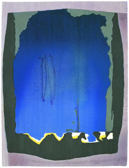
Helen Frankenthaler (American, 1928–2011), Milkwood Arcade, 1963. Acrylic on canvas, 86 ½ x 80 ¾ in. Helen Frankenthaler Foundation. © 2017 Helen Frankenthaler Foundation, Inc. : Artists Rights Society (ARS), New York
(WILLIAMSTOWN, Mass.) – No Rules: Helen Frankenthaler Woodcuts, an exhibit exploring the artist’s inventive and groundbreaking approach to the woodcut, and As in Nature: Helen Frankenthaler Paintings, which focuses on nature as a long-standing inspiration for the artist, open at the Clark Art Institute on Saturday, July 1.
The No Rules exhibition, on view through Sunday, September 24, includes 17 large-scale prints, on loan primarily from the Helen Frankenthaler Foundation and the Williams College Museum of Art, presenting the full range of Frankenthaler’s experimentation with the medium from the 1970s through 2000s. No Rules celebrates the pioneering spirit that expanded the possibilities of the woodcut and established Frankenthaler (American, 1928–2011) as one of the medium’s great innovators.
The exhibition explores the artist’s collaborations with printers, publishers, woodcarvers, and papermakers that pushed the medium in new directions. In 1994, during an interview with printer/publisher Ken Tyler, Frankenthaler stated, “There are no rules, that is one thing I say about every medium, every picture . . . that is how art is born, that is how breakthroughs happen. Go against the rules or ignore the rules, that is what invention is about.”
As in Nature: Helen Frankenthaler Paintings, which focuses on nature as a long-standing inspiration for the artist, is on view in the Lunder Center at Stone Hill from Saturday, July 1, through Monday, October 9.
The As in Nature exhibition comprises a selection of large paintings by Frankenthaler from the 1950s through the 1990s, focusing on nature as a longstanding inspiration. Like many abstract artists, Frankenthaler continually tested the constraints of the genre, at times inserting into her compositions elements of recognizable subject matter that throw the abstract elements into relief. The paintings in this exhibition represent the full range of styles and techniques that she explored over five decades of work; while all are primarily abstract, they also contain allusions to landscape, demonstrating how Frankenthaler’s delicate balance between abstraction and a nuanced responsiveness to nature and place developed and shifted over time. As Frankenthaler once commented, “Anything that has beauty and provides order (rather than chaos or shock alone), anything resolved in a picture (as in nature) gives pleasure—a sense of rightness, as in being one with nature.”
“The natural landscape of the northeastern United States served as a significant source of inspiration for Helen Frankenthaler throughout her career,” said Olivier Meslay, director of the Clark. “Exhibition curator Alexandra Schwartz has brought together wonderful examples of Frankenthaler’s work that are particularly relevant to our understanding of her engagement with nature as both subject and inspiration. We look forward to displaying these large, color-drenched canvases in our galleries at the Lunder Center at Stone Hill, whose setting will surely encourage a dialogue between art and nature.”
Schwartz said, “As in Nature examines Frankenthaler’s decades-long engagement with the tradition of landscape painting, within the context of her extraordinary career. The exhibition and catalogue consider the critical reception of her work, particularly as a pioneering woman artist.”
Frankenthaler experimented tirelessly in her painting, always seeking to develop new styles, materials, and techniques. She sometimes alluded to nature directly, through titles such as Milkwood Arcade (1963) that refer to natural themes or even specific places, and sometimes indirectly, through colors, forms, and textures.
Though trained in abstraction at the Dalton School, Bennington College, and briefly with the painter Hans Hofmann in Provincetown, Massachusetts, she sometimes sketched outdoors, working directly from the landscape. She was an enthusiastic student of the history of art, frequently quoting historical paintings by artists such as Gustave Courbet and J. M. W. Turner, as in Barometer (1992), or traditional artistic genres, especially landscape painting.
EXPERIMENTS WITH LANDSCAPE: EARLY WORK
During the 1950s and ’60s, Frankenthaler explored various styles of abstraction, from Cubist-inspired works such as Abstract Landscape (1951) to more free-form compositions such as Untitled (1962–63). During this period, she developed her influential “soak-stain” technique, in which she poured thinned paint directly onto raw, unprimed canvas laid on the studio floor. This approach allowed her to layer washes of paint on top of one another, creating unusual combinations of colors and forms and blurring the traditional distinction between figure and ground. Giralda (1956) refers to the bell tower of Seville Cathedral, which the artist visited in 1954. The mostly brown and blue palette evokes the landscape of southern Spain, and the exposed raw canvas approximates the hue of the cathedral’s stone walls.
Milkwood Arcade (1963) is another example of Frankenthaler’s experimentation with the soak-stain technique. Set against earthy browns, ochres, and blues, its large passages of green hint at the trees suggested by the work’s title. Frankenthaler appears to have been absorbed by the technical aspects of painting in this work—her flowing paint and the forms that emerge from it are precise and subtle—but its poetic title underlines its relationship to landscape.
THE BEAUTIFUL AND SUBLIME: LATER WORK
In Frankenthaler’s later work, her interest in landscape persisted. Many of her paintings took the horizontal format of traditional landscape painting, and she often made references to nature through the use of color.
Off White Square (1973) is a monumental canvas measuring more than twenty-five feet in length and six feet in height, created in the traditional horizontal format of a landscape painting. The canvas is mostly covered in the artist’s typical thin, horizontal washes of color, but also contains uncharacteristic geometric abstractions such as the off-white square referred to in the title. Some layers comprise deep, shocking pinks and school-bus yellows—colors not usually found in nature—while others consist mostly of greens, blues, and grays—organic tones suggestive of ponds and rivers. Frankenthaler plays with the tradition of landscape painting by contrasting these artificial and natural hues.
Yet for all of her paintings that celebrate nature as a joyous respite, as many point to its unpredictability and even violence. Many of Frankenthaler’s works of the 1980s and ’90s, such as Tethys (1981) and Red Shift (1990), feature unsettling contrasts among colors and forms, evoking the drama inherent in nature.
In Greek mythology, Tethys was the Titan offspring of the gods Uranus (Sky) and Gaia (Earth), and the mother (by her brother Oceanus) of the river gods and Oceanids. This painting’s natural brown and blue palette alludes to the earth, sky, and water of the myth. The rounded, crater-like shapes, unusual for Frankenthaler, contribute to a sense of depth, like tunnels through underground layers of soil and stone. Streaks of ore are evoked by the blue-green hues, which resemble oxidized metal. With its dark, somber palette, the painting conveys a sense of foreboding.
Frankenthaler looked closely at landscapes by nineteenth-century painters and was influenced by their depictions of nature as sublime and often terrifying, as well as beautiful. Two paintings from 1992 share the horizontal format typical of landscape painting, but vary dramatically in mood. The Birth of the Blues (1992) features cool blues and greens painted in choppy horizontal brushstrokes, their rhythms echoing the music referenced in the title. Barometer (1992) is composed entirely of white and gray tones, rendered in swirling strokes of paint. With its black, white, and gray palette and hints of a horizon line, it recalls the seascapes of Gustave Courbet and J. M. W. Turner, both of whose work Frankenthaler greatly admired.
A fully illustrated catalogue accompanying the exhibition includes an essay by curator Alexandra Schwartz. The catalogue, published by the Clark and distributed by Yale University Press, also includes the essay “Innate Appreciation: William Louis-Dreyfus and the Works of Helen Frankenthaler” by Christina Kee, assistant curator with the Louis-Dreyfus Family Collection.
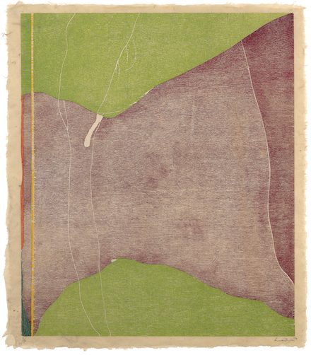
Freefall, 1993. Twelve-color woodcut from twenty-one woodblocks on hand-dyed paper, 78 1/2 x 60 1/2 in. Helen Frankenthaler Foundation © 2017 Helen Frankenthaler Foundation, Inc. / Artists Rights Society (ARS), New York / Tyler Graphics Ltd., Mount Kisco, N.Y.
NO RULES: WOODCUTS
Speaking about the No Rules exhibition, Olivier Meslay, director of the Clark, said, “Frankenthaler experimented with the woodcut until the end of her career, creating a body of work that both engages with printmaking and challenges a conventional understanding of the medium. We hope that showing her paintings and woodcuts in tandem will serve as a reminder and a reaffirmation of Frankenthaler’s status as an artist of enduring value –– and introduce her exceptional works to new audiences as well.”
“Not only are Frankenthaler’s works visually mesmerizing, they are technically complex,” said exhibition curator Jay A. Clarke. “She was not content to use earlier methods of production; she wanted to push herself in new directions and allowed herself to be encouraged and challenged by the printers and publishers with whom she collaborated. Frankenthaler’s paintings were created in the isolation of her studio, but the process of carving and printing woodblocks in collaboration with others brought new challenges to the artist — ones she relished.”
Frankenthaler’s printmaking experience began with creating lithographs at Universal Limited Art Editions (ULAE), the print publisher founded by Tatyana Grosman in West Islip, Long Island, New York. Grosman played a significant role in Frankenthaler’s early print career, encouraging her to continually push forward into new media, such as lithography, etching, and aquatint.
In 1973, when Frankenthaler made her first woodcut, East and Beyond, at ULAE, she was already a very well-established painter. The title reflects her fascination with Japanese woodblock prints, especially the subtle colors found in the work of Utagawa Hiroshige (1797–1858), an artist whose work she owned. The print was made by carving a single block of wood into pieces and inking each one with a different color. After ink was applied to the pieces, instead of reassembling the blocks like a jigsaw puzzle before printing, the printer would carefully register each color block separately to avoid negative space between them.
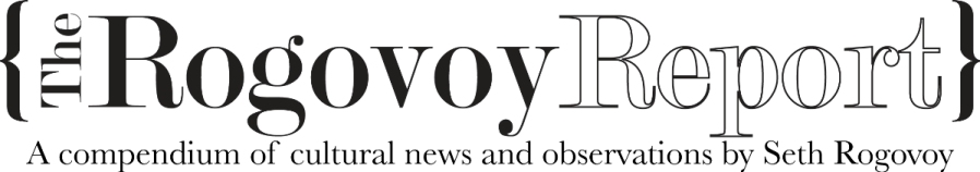
Savage Breeze (1974) is considered one of Frankenthaler’s finest printed works and, together with East & Beyond (1973), has been credited with marking the beginning of a woodcut revival in America. When the artist first printed this work, it did not have the luminosity she desired, so she decided to print an entire block of white-inked wood over the surface of the paper before adding the eight separate color blocks. The layer of white ink brightened the colors that were subsequently placed over it.
Despite difficulties she experienced creating Savage Breeze, Frankenthaler returned to the practice in 1976, working with another major print publisher, Kenneth Tyler, at Tyler Graphics in Bedford Village, New York. The resulting print, Essence Mulberry (1977), was created using a method that allows the grain of the wood to remain visible within deep and blended coloration and leaves a portion of the paper untouched. Frankenthaler used these three elements in her printmaking—visible grain, depth of blended color, and paper treatment — throughout the rest of her career.
Although Frankenthaler made only two woodcuts in the 1980s, Cameo (1980) and Cedar Hill (1983), they remain among her most significant woodcuts. They mark a new layered approach to color and an increased engagement with the medium’s eastern origins. Cameo furthered the use of layered color found in Essence Mulberry, resulting in a field of color that influenced the artist’s future works. It also introduced the technique of “guzzying,” a term Frankenthaler used to describe the way she would manipulate the surface of the woodblock, marking it in this case with sandpaper and dental tools to achieve the desired textured effects before printing. The resulting colors are not static and distinct, but rather are subtle and diaphanous.
In 1983, Frankenthaler traveled to Japan and worked with the expert woodcarver Reizo Monjyu and the printer Tadashi Toda. While there she created Cedar Hill, a woodcut that features trailing lines and washes of color combined with a sense of the texture of the wood itself and a spare use of small marks.
Frankenthaler continued to experiment in Freefall (1993), working with dyed paper-pulp printed with color blocks to create layers of color. Here she made the paper by hand-dying the pulp in various colors. The size of Freefall is significant in its own right—78 1/2 x 60 1/2 inches. To create a sheet of paper this large is a feat, and to complicate it further by adding twenty-one woodblocks illustrates Frankenthaler’s willingness to push the boundaries of the medium.
The series of prints Tales of Genji I–VI (1998) was created in the nineteenth-century tradition of Japanese ukiyo-e (scenes of the floating world), in which the artist creates the initial painting, and woodcarvers and printers make the final print. Frankenthaler first made six different paintings on wood, after which woodcarvers and papermakers interpreted them under her supervision. All variations on a theme, the series takes its title from the eleventh-century Japanese literary tale about an emperor’s son and his life in the Imperial Court, written by Murasaki Shikibu (c. 978–1014), whose knowledge of Japanese court life came from her experience as lady-in-waiting to Empress Sh?shi.
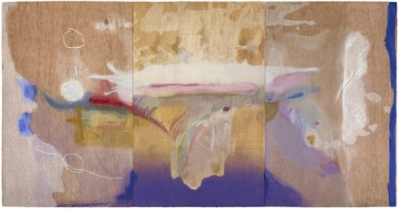
Madame Butterfly, 2000. 102-color woodcut from forty-six woodblocks on three sheets of handmade paper, 41 3/4 x 79 1/2 in. Helen Frankenthaler Foundation © 2017 Helen Frankenthaler Foundation, Inc. / Artists Rights Society (ARS), New York / Tyler Graphics Ltd., Mount Kisco, N.Y.
Madame Butterfly (2000) is considered by some to be Frankenthaler’s version of a Japanese screen in printed form. As in the Tales of Genji series, she began by making a painting on wood that was translated over a period of two years into woodcut form, with the assistance of expert woodcarvers and papermakers. Sharing its title with a 1904 opera by Giacomo Puccini, the triptych Madame Butterfly is infused with light pastel colors and stained, expressive marks. However, as with many of the artist’s prints, it does not demonstrate an explicit connection to its title.
This is also true of the titles of Frankenthaler’s final woodcuts, which refer to different types of trees found and observed through the seasons on her property in Darien, Connecticut. Weeping Crabapple (2009), the last woodcut she made, looks less like a woodcut than any of her previous works. It uses the effects of a wash drawing with charcoal in woodcut form to evoke the gray drooping branches and vibrant pink tones of the flowers.
The Clark renews its association with the artist this summer through these exhibitions. Helen Frankenthaler maintained a lifelong connection to Bennington College, located less than 20 miles from Williamstown, and established numerous connections to the local region.
During the 1979–80 academic year, Frankenthaler was part of the Williams College Artist-in-Residence Program. At the culmination of her tenure, the Clark presented and toured a comprehensive exhibition of her prints, curated by Thomas Krens, then director of the Artist-in-Residence Program and incoming director of the Williams College Museum of Art.
ABOUT THE CLARK
The Clark Art Institute, located in the Berkshires of western Massachusetts, is one of a small number of institutions globally that is both an art museum and a center for research, critical discussion, and higher education in the visual arts. Opened in 1955, the Clark houses exceptional European and American paintings and sculpture, extensive collections of master prints and drawings, English silver, and early photography. Acting as convener through its Research and Academic Program, the Clark gathers an international community of scholars to participate in a lively program of conferences, colloquia, and workshops on topics of vital importance to the visual arts. The Clark library, consisting of more than 270,000 volumes, is one of the nation’s premier art history libraries. The Clark also houses and co-sponsors the Williams College Graduate Program in the History of Art.
The Clark is located at 225 South Street in Williamstown, Massachusetts. Galleries are open Tuesday through Sunday, 10 am to 5 pm; open daily in July and August. Admission is $20; free year-round for Clark members, children 18 and younger, and students with valid ID. For more information, visit The Clark or call 413 458 2303.